Sunday, November 1, 2015

Font Terms

SMALL CAPS: or "small caps" are capital letters that are the same height as a lowercase "x" from the same typeface, therefore they are shorter than the normal capital letters from the same font family. *Bookman does have small caps

EXAMPLE: AaBbCcDdEeFfGgHhIiJjKkLlMmNnOoPpQqRrSsTtUuVvWwXxYyZz

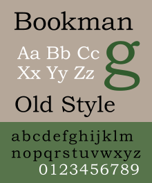
LIGATURES: when two or more letters are joined together to form a single character. Some ligatures represent certain sounds, like the diphthongs æ œ
*Bookman does have ligatures

FOOT MARK: aka "prime symbol" looks very similar to an apostrophe, but should be used for mathematics and measurements. Depending on the font, it can be very difficult to tell the difference, but correcting this common mistake can set your typography apart. 

APOSTROPHE: used in contractions and to show possession of something. Usually, these are more curved or curly than the simplistic foot mark.

INCH MARK vs. SMART QUOTE: inch marks, like foot marks, should only be used in measurements, they are usually straight and simple. However, "smart quotes" should be used to signify a quotation. These marks tend to be curlier than inch marks.

HYPHEN: mostly used for the formation of certain compound terms and for word division, never use a hyphen in the place of an en dash or an em dash.

EN DASH: slightly wider than the hyphen, but narrower than the em dash, the en dash is mostly used for representing a span or range of numbers, dates, or times. 

EM DASH: depending on the context, the em dash can take the place of commas to enhance readability, parenthesis for a less formal sentence, and colons when you want to emphasize the conclusion of a sentence. 

Sunday, October 18, 2015

Bookman

FONT INFO:
  • Sans-Serif
  • Designed by Alexander Phemister
    • Also designed Franklin Old Style
  • Designed in 1858
  • Classification: Transitional
  • Light (Bold, Italic), Medium (Bold, Italic), Demi (Bold, Italic), Bold (Italic)

FONT CLASSIFICATIONS:

  • Old Style: Typefaces that are considered "Old Style" are seriffed fonts that are based on Roman typefaces from the fifteenth and sixteenth centuries that emulated classical calligraphy. 
    • Examples: Garamond, Times New Roman, Minion Pro


  • Transitional: These typefaces were considered "shocking" when they were first introduced in the mid eighteenth century. These typefaces tend to have a more vertical axis and sharper serifs than their Old style predecessors. They also have higher contrast between the thick and thin stroke widths. 
    • Examples: Baskerville, Bookman, Cambria

  • Modern: These typefaces were considered radical and abstract because of their extremely sharp contrast between the thick and thin lines.
    • Examples: Bodoni, Adobe New Caledonia, Didot


  • Slab Serif: Introduced in the nineteenth century, slab-serif fonts are bold and decorative with heavy and slab-like serifs.
    • Examples: Clarendon, Rockwell, Memphis


  • Sans-Serif: This kind of typeface became popular in the twentieth century. Sans-Serif literally means "without serifs" and are uniform and upright. In geometric sans-serif fonts, the o's are perfect circles and the peaks of m's and a's are sharp triangles. 
    • Examples: Gill Sans, Helvetica, Futura


Key Terms: 
  • Stroke Weight: the thickness of lines in a font character
  • Axis: an imaginary line drawn from the top to the bottom of a glyph bisecting the character
  • Small caps: uppercase letterforms that are smaller in height than the capital letters in a given typeface
  • Lining Figures: all characters align at the baseline and at a common height
  • Ligatures: two or more letters joined together to form one character
Type Measurements:
         Type size is measured in points. This refers back to when type was cast in metal, and a 10 point type is measuring the block of metal, or "body," that the type was set on. The proportion of the typeface on the body could vary from one typeface to another, so a 10 point typeface refers to the measurement from the baseline to the top of the body. This means that one 10 point typeface may look smaller than another, but they will both take up the same depth on a line of text. 


Wednesday, October 14, 2015

Emigre Fonts

Font: Platelet
Designer: Connor Mangat in 1993
This font was based on the California license plate, therefor all the letters have the same character width. According to the designer, this required some creative problem solving. For example "i" and the "l" fill their character widths with a large curve, or hook, shape at the bottom.
To me, the letters that include perfect circles are the most interesting, such as the upper-case "P," especially when it is juxtaposed by a letter made of only straight lines and right angles. This can be seen in the word "DELPHINIUM" in the image above.
Words that come to mind: uniform, rigid, restricted, mechanical, geometric. 

Font: Priori
Designer: Jonathan Barnbrook in 2003
Barnbrook based this typeface off of British typography from the early 20th century. He embraced signage from cathedrals and public buildings from his London neighborhood. 
I am drawn to a few of the letters from this typeface. The one that clearly sticks out is the "a," which is just a triangle. This is interesting because it is a purely geometric solution, but it is still readable as an A when it is put into a word. I am also drawn to the upper-case "N" because of the way the crossbar doesn't reach all the way down to the baseline.
Words that come to mind: meaningful, historical, non-traditional, thin

Font: Variex
Designer: Rudy VanderLans and Zuzana Licko in 1988
This font is just interesting all around. I am drawn in by the capitol H because of its uneven stem heights, as well as the S because of its vertical nature. The way each letter aligns with the next when put into words is very pleasing to the eye. 
Words that come to mind: bold, playful, curvy, light, uneven.

Thursday, September 17, 2015

Who is Wim Crouwel


Wim Hendrik Crouwel is an influential typeface designer who was born in Groningen in 1928. His most famous designs include New Alphabet, which was made up of only horizontal and vertical strokes, Fodor Alphabet, and Gridnik, which was an octagonal typeface made for a typewriter that was never released. The font "Atmosphere," by Jay Vidheecharoen was inspired by Wim Crouwel's New Alphabet, and Jonathan Hill's "LineWire" is an octagonal typeface based on Wim Crouwel's work. 
                                   

Sunday, September 13, 2015

Deceased Designers: Max Bill

Max Bill worked as an architect, painter, graphic artist, and sculpturist in Zurich before becoming a product designer. His works took on their own independent character over time with his use of geometry and abstraction. He was very influential on designers and played a crucial role in the development of modern art.


Sources: http://www.moma.org/collection/artists/559, http://www.max-bill.com/

Deceased Designers: El Lissitzky

El Lissitzky was a Russian born designer, photographer, typographer, and architect who has continued to be a major influence on designers long after his death. He designed propaganda and exhibitions for the soviet union and was able to maintain his position as Head of Exhibitions under Stalin even when stricter regulations were put in place for designers.


source: http://www.designishistory.com/1920/el-lissitzky/

Deceased Designers: Robert Massin

Robert Massin was a French graphic designer born in 1925. He is internationally revered and well known due to his typographic experimentations. His works have been published internationally in books about the history of design, and Massin himself wrote over thirty books of his own.


source: http://www.designculture.it/interviews/robert-massin.html#start

Deceased Designers: Max Huber

Max Huber was born in Switzerland in 1919. He always worked as a freelance designer, and was able to find a balance between the needs of his clients and his need to experiment. He was particularly enthusiastic about his designs for jazz album covers and posters/publications for Jazz events.


source: http://www.iconofgraphics.com/Max-Huber/

Deceased Designers: Paul Rand


Paul Rand, born Peretz Rosenbaum, grew up in Brooklyn, New York as an orthodox Jew. He studied at the Pratt Institute and the Parsons School of Design. Rand taught design at Yale University and did design work for companies such as ABC, IBM, and UPS. He was inducted into the New York Art Directors Hall of fame in 1972.


Source: http://www.paul-rand.com/

Tuesday, September 8, 2015

Living Designers: Erik Speakermann

 Erik Speakermann is a German typographer and designer. He and his wife founded FontShop together, which was the first mail order distributer for digital fonts. Speakermann has also done work for majorly well-known clients such as Audi and Volkswagen. In 2007, he was the first designer to be elected into the European Design Awards Hall of Fame.


Source: https://en.wikipedia.org/wiki/Erik_Spiekermann

Living Designers: Paula Scher


 Paula Scher was named to the Art Directors Club Hall of Fame in 1998 for her innovative designs and eclectic approach to typography. in 2000, she also received the Chrysler Award for Innovation in Design, and in 2001 she received the AIGA medal, which is the professions highest honor. She has work in the permanent collection at the Museum of Modern Art and the Cooper-Hewitt national design museum.


Source: http://www.aiga.org/medalist-paulascher/

Living Designers: Jessica Hische


"Jessica Hische is a letterer, illustrator, and crazy cat lady known for her silly side projects and occasional foul mouth." She has done advertisements for extremely well-known clients such as Starbucks, Wes Anderson, Tiffany & Co., Victoria's Secret, and Target. 


Sources: http://jessicahische.is/anoversharer 

Living Designers: Wolfgang Weingart


Wolfgang Weingart is a Swiss type designer and instructor at the Schule Für Gestaltung Basel. His type designs contain a certain spontaneity and carelessness that was juxtaposed by the more typical Swiss orderliness of his time. Weingart was presented with the AIGA Medal at "Bright Lights: The AIGA Awards," on April 19, 2013, in New York City


Source: http://www.aiga.org/medalist-wolfgang-weingart/

Living Designers: Neville Brody


Neville Brody attended both the London College of Printing and the Hornsey College of Art. Born and raised in London, Brody says he has been drawing since before he could walk and could never see himself in any field other than Design.  His name was made popular while he was Art Director for The Face magazine when it was launched in the 1980's. 


sources: http://www.designboom.com/design/interview-with-graphic-designer-neville-brody-10-10-2014/, https://en.wikipedia.org/wiki/Neville_Brody