- Sans-Serif
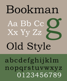
- Designed by Alexander Phemister
- Also designed Franklin Old Style
- Designed in 1858
- Classification: Transitional
- Light (Bold, Italic), Medium (Bold, Italic), Demi (Bold, Italic), Bold (Italic)
FONT CLASSIFICATIONS:
- Old Style: Typefaces that are considered "Old Style" are seriffed fonts that are based on Roman typefaces from the fifteenth and sixteenth centuries that emulated classical calligraphy.
- Examples: Garamond, Times New Roman, Minion Pro

- Transitional: These typefaces were considered "shocking" when they were first introduced in the mid eighteenth century. These typefaces tend to have a more vertical axis and sharper serifs than their Old style predecessors. They also have higher contrast between the thick and thin stroke widths.
- Examples: Baskerville, Bookman, Cambria

- Modern: These typefaces were considered radical and abstract because of their extremely sharp contrast between the thick and thin lines.
- Examples: Bodoni, Adobe New Caledonia, Didot

- Slab Serif: Introduced in the nineteenth century, slab-serif fonts are bold and decorative with heavy and slab-like serifs.
- Examples: Clarendon, Rockwell, Memphis

- Sans-Serif: This kind of typeface became popular in the twentieth century. Sans-Serif literally means "without serifs" and are uniform and upright. In geometric sans-serif fonts, the o's are perfect circles and the peaks of m's and a's are sharp triangles.
- Examples: Gill Sans, Helvetica, Futura

Key Terms:
- Stroke Weight: the thickness of lines in a font character
- Axis: an imaginary line drawn from the top to the bottom of a glyph bisecting the character
- Small caps: uppercase letterforms that are smaller in height than the capital letters in a given typeface
- Lining Figures: all characters align at the baseline and at a common height
- Ligatures: two or more letters joined together to form one character
Type size is measured in points. This refers back to when type was cast in metal, and a 10 point type is measuring the block of metal, or "body," that the type was set on. The proportion of the typeface on the body could vary from one typeface to another, so a 10 point typeface refers to the measurement from the baseline to the top of the body. This means that one 10 point typeface may look smaller than another, but they will both take up the same depth on a line of text.


